Garmentory | Brand Redesign
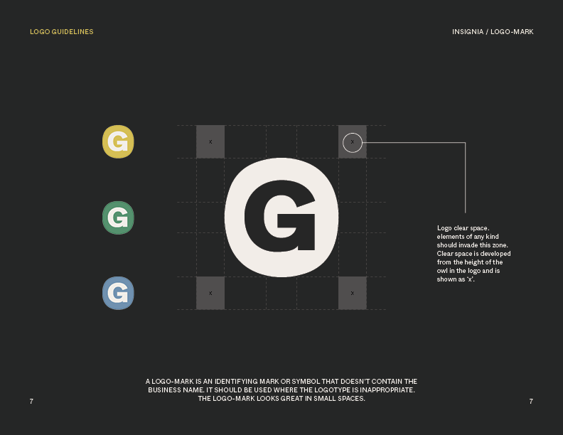
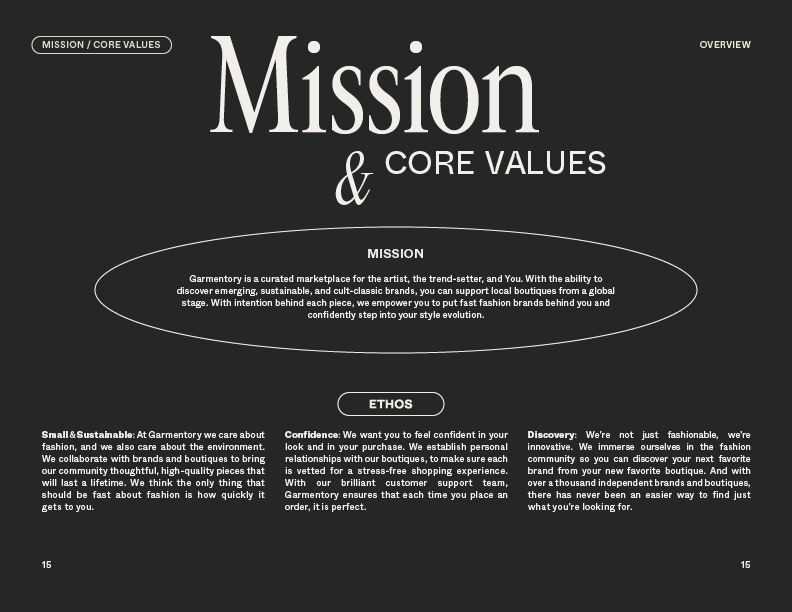
I led the brand redesign project which included iterating on a new logo, adding new typefaces, colors, shapes, and tone—and then implementing the new brand elements across the site and marketing channels while leading all Garmentory teams through the changes.
When I first joined the team, the redesign was my biggest goal, however, it took time to convince leadership it was needed. After creating a “baby step” brand refresh (in 2019) I was able to show the team the power of small changes in design to add trust and maturity to the brand identity. Once the brand refresh in 2019 was implemented, I began working on the full brand redesign.
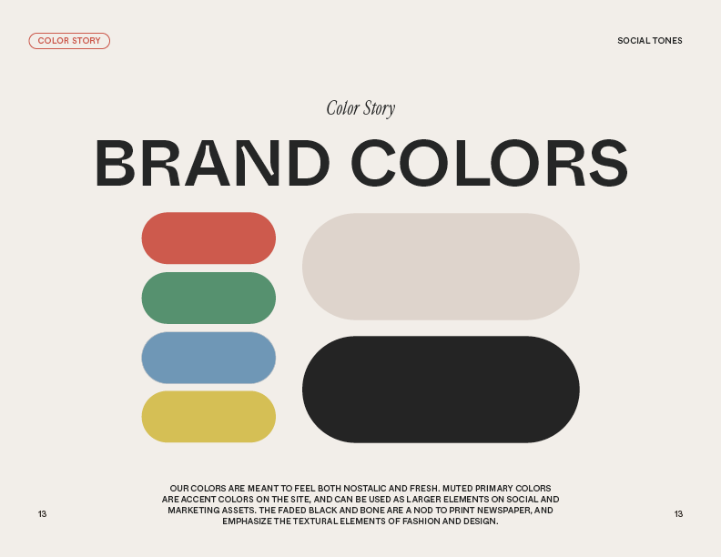
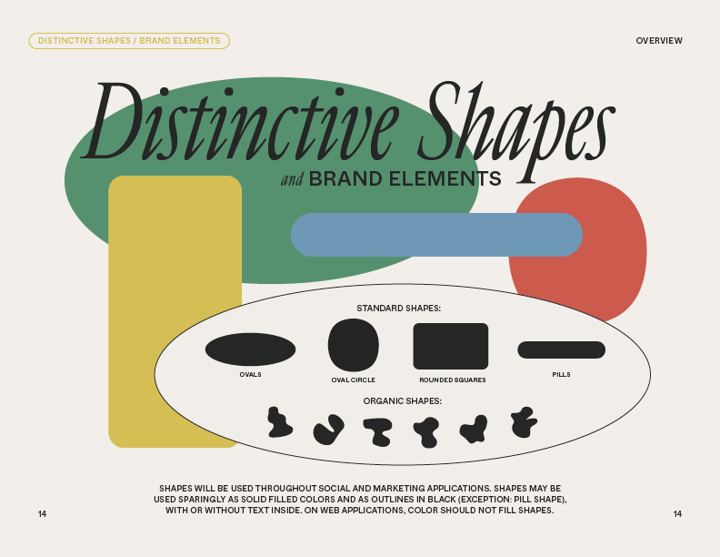
The biggest challenge was incorporating shapes and colors to make the brand feel more approachable without being too young or immature. The faded black and bone replace the standard black and white to add a high-end paper-like feel, while the muted primary colors create a sense of nostalgia and playfulness. The rounded corners, ovals, and squishy circles were all added to have standard shapes and corners throughout the site and marketing/social assets for consistency and an added layer of design that the previous brand identity didn’t have.
Packaging Design
I created a kraft mailer, postcard, and stickers for all Garmentory vendors to use in their orders and worked with NoIssue and EcoEnclose to get them into production.


